Come enjoy a graphical exploration of various propensity score weighting schemes.
Author
Lucy D’Agostino McGowan
Published
January 17, 2019
Let’s create a toy dataset
For this post, I’m going to use this generated dataset as an example.
Here I am using the terminology ‘treatment’ for consistency, but these methods are not confined to the medical setting. You can also think of this as an ‘exposure’. For example, you could be interested in how ‘exposing’ users to a certain UI effects an outcome, like whether they purchase a product.
Here, I am simulating two variables, \(x_1\) and \(x_2\). These are my pre-treatment characteristics (we’ll define that soon!). I am then using these to create a binary treatment variable. This treatment variable depends on x_1 and x_2. Finally, I have generated an outcome variable dependent on the treatment and these pre-treatment characteristics, making the treatment effect equal to 2.
A lot of my research is in the observational study space. This basically mean that participants in the study were not randomly assigned treatments or exposures, but rather we just observe how a certain exposure affects an outcome. For example, in one of the studies I worked on, we were interested in whether a certain diabetes drug was associated with heart disease. Instead of randomly assigning some patients to take diabetes drug A and some to take a diabetes drug B, we evaluated the electronic health records of patients who were already taking the drugs and assessed their health after. There are some issues with this analysis - since we didn’t randomly assign patients to drug A and drug B, it is possible that doctors selected one drug over the other for certain reasons that reflect patient characteristics. For example, perhaps healthier patients are often prescribed drug A – this could make it look like those who take drug B are more likely to have heart disease simply based on their pre-treatment characteristics. Propensity scores help to adjust for these pre-treatment characteristics.
What is a propensity score?
A propensity score is the probability of being assigned to a certain treatment, conditional on pre-treatment (or baseline) characteristics. This can be estimated in different ways, but most commonly it is estimated using logistic regression. Using the simulated dataset from above, we can do this in R with the following code:
dat <- dat %>%mutate(propensity_score =glm(treatment ~ x_1 + x_2, data = dat, family ="binomial") %>%predict(type ="response") )
Notice here I fit a logistic regression, predicting the treatment from the pre-treatment characteristics, x_1 and x_2 using the glm() function along with the family = "binomial" option. I then used the predict() function along with type = "response" to obtain the conditional probabilities of treatment assignment.
What are we trying to estimate?
The point of the propensity score is to allow you to estimate the treatment or exposure effect in an unbiased way. This works based on a few assumptions:
You have measured all of the necessary pre-treatment characteristics - this is sometimes known as “no unmeasured confounding”
All participants have a non-zero probability of receiving either exposure / treatment
Ultimately, we are interested in some estimate of the treatment effect, for example we may want to know what the average treatment effect is across all participants, or we may want to know what the average treatment effect is among participants who received the treatment. I’ll describe a few different causal quantities of interest.
Average Treatment Effect
The Average Treatment Effect (ATE) is generally the quantity estimated when running a randomized study. The target population is the whole population, both treated and controlled. While this is often declared as the population of interest, it is not always the medically or scientifically appropriate population. This is because estimating the ATE assumes that every participant can be switched from their current treatment to the opposite, which doesn’t always make sense. For example, it may not be medically appropriate for every participant who didn’t receive a treatment to receive it.
Average Treatment Effect Among the Treated
The Average Treatment Effect Among the Treated (ATT) estimates the treatment effect with the treated population as the target population.
Average Treatment Effect Among the Controls
The Average Treatment Effect Among the Controls (ATC) estimates the treatment effect with the controlled population as the target population.
Average Treatment Effect Among the Evenly Matchable
The Average Treatment Effect Among the Evenly Matchable (ATM) estimates the treatment effect with a matched population as the target population. The estimated population is nearly equivalent to the cohort formed by one-to-one pair matching.
My dissertation explores some nice properties of ATM and ATO weights if you are interested in a deeper dive!”
Average Treatment Effect Among the Overlap Population
The Average Treatment Effect Among the Overlap Population (ATO) estimates the treatment effect very similar to the ATM, with some improved variance properties. Basically, if you estimated the probability of receiving treatment, the “overlap” population would consist of participants who fall in the middle - you’re estimating the treatment effect among those likely to have received either treatment or control. I’ll include some graphs in the following sections to help better understand this causal quantity.
How do we incorporate a propensity score in a weight?
Each of these causal quantities has a weight associated with it. Brace yourself for a little bit of math (but I’ll include R code immediate after so hopefully it won’t be too bad!).
The propensity score for participant \(i\) is defined here as \(e_i\) and the treatment assignment is \(Z_i\), where \(Z = 1\) indicates the participant received the treatment and \(Z = 0\) indicates they received the control.
Let’s look at some graphs to better understand what these weights are doing.
I first saw these mirrored histograms in this context in a paper by Li & Greene and loved them!
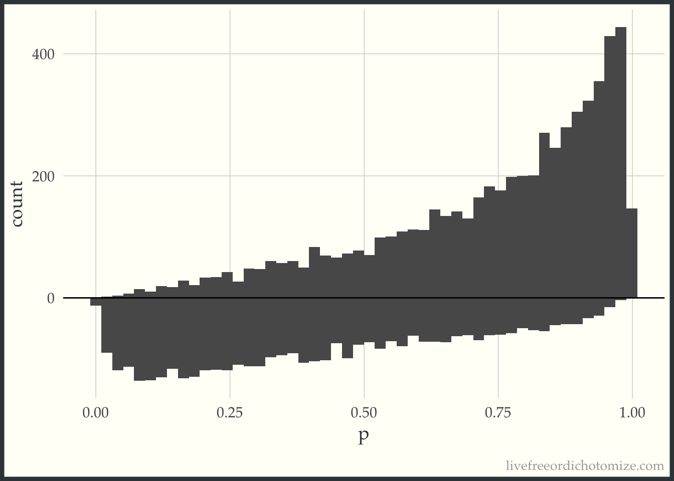
First, I am going to just plot a histogram of the propensity scores for the two populations, those who received treatment (treatment = 1), and those who received the control (treatment = 0). The histogram above the 0 line is the distribution of propensity scores among the treated. The histogram below the 0 line is the distribution of propensity scores among the controls.
d <- dat %>% tidyr::spread(treatment, propensity_score, sep ="_p")ggplot(d) +geom_histogram(bins =50, aes(treatment_p1)) +geom_histogram(bins =50, aes(x = treatment_p0, y =-..count..)) +ylab("count") +xlab("p") +geom_hline(yintercept =0, lwd =0.5) +scale_y_continuous(label = abs)
Examining this, we can see in this simulated sample, more patients received the treatment than the control. We can also see that among those who received the treatment, propensity scores tend to be higher (we can see this based on the skew of the histogram, with more mass towards the right where the propensity scores are closer to 1). This makes sense, since the propensity score is the probability of receiving treatment, those who received it probably had a higher probability of doing so.
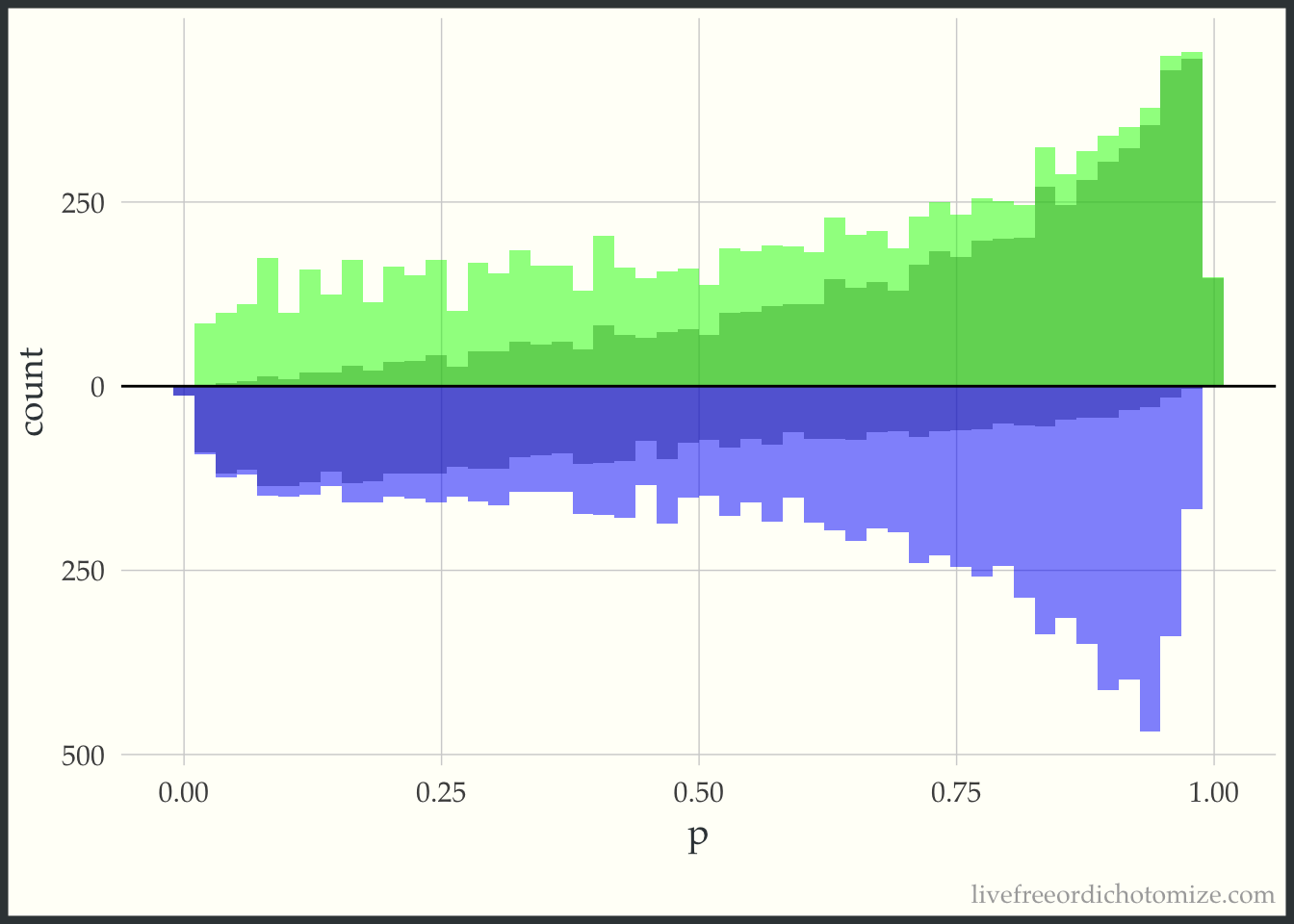
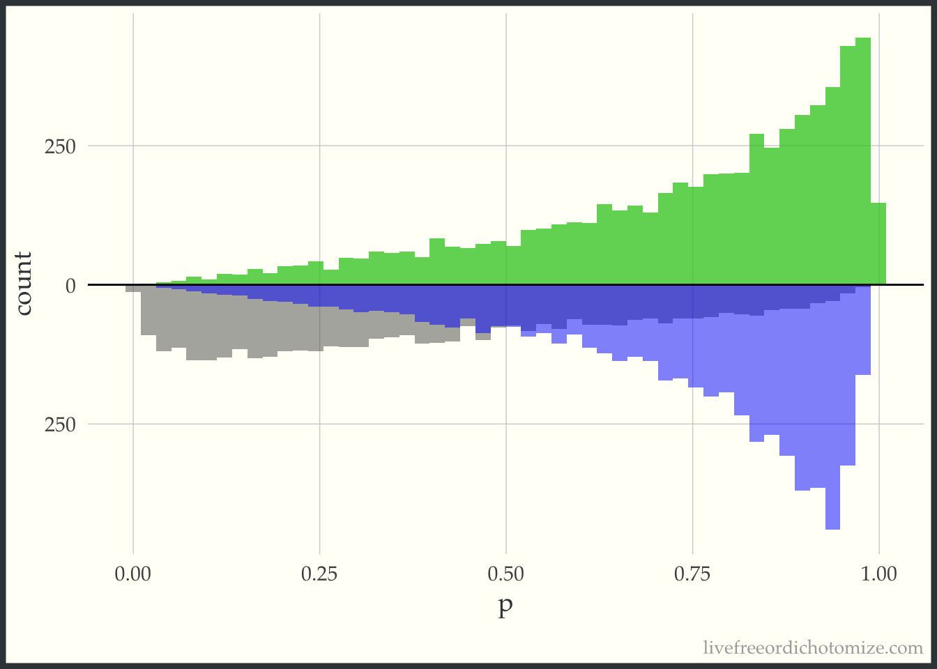
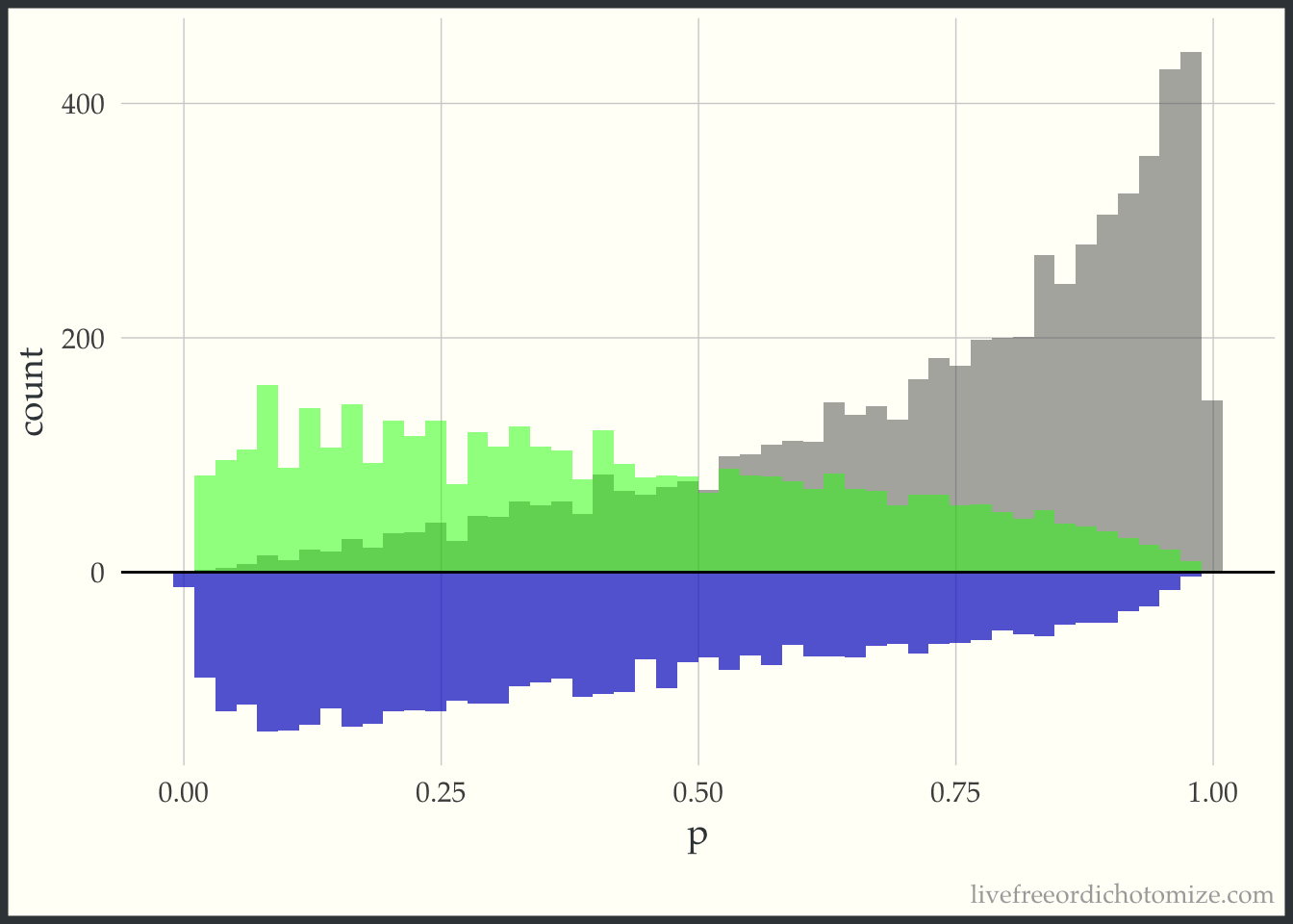
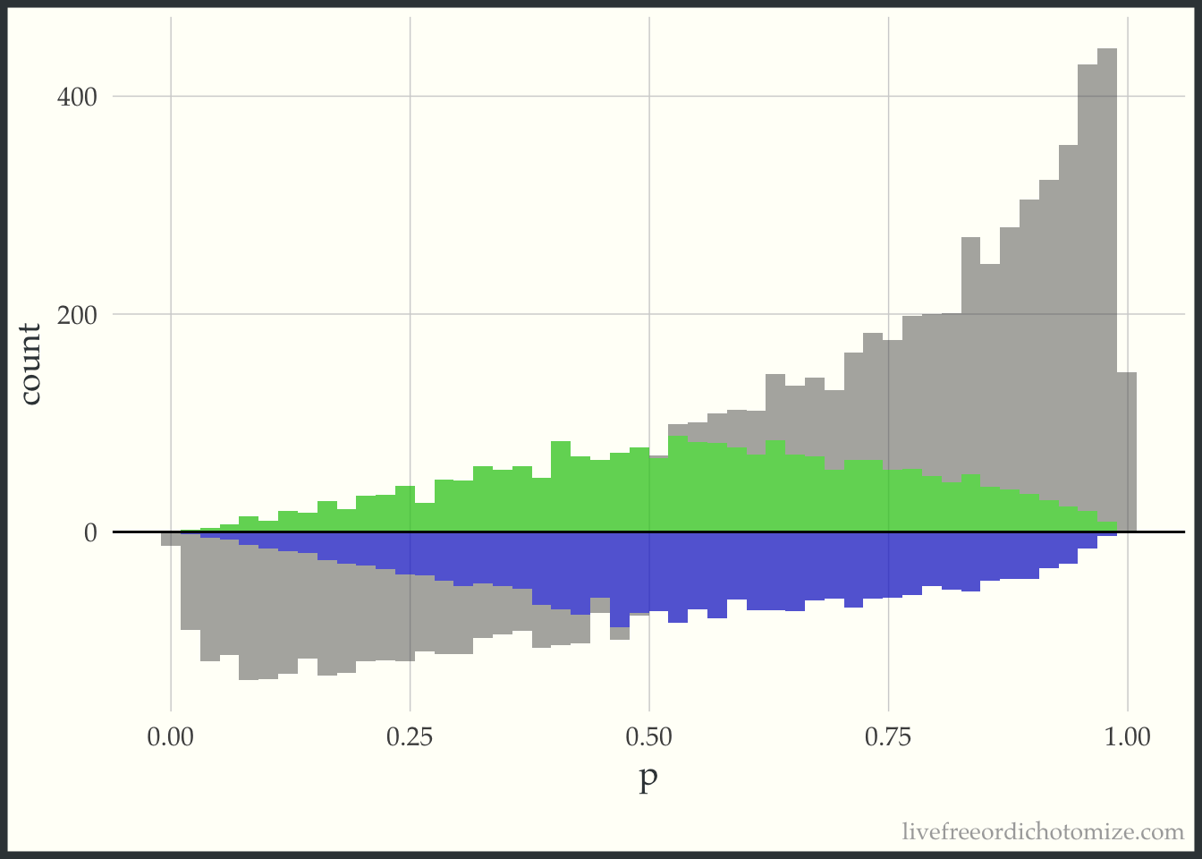
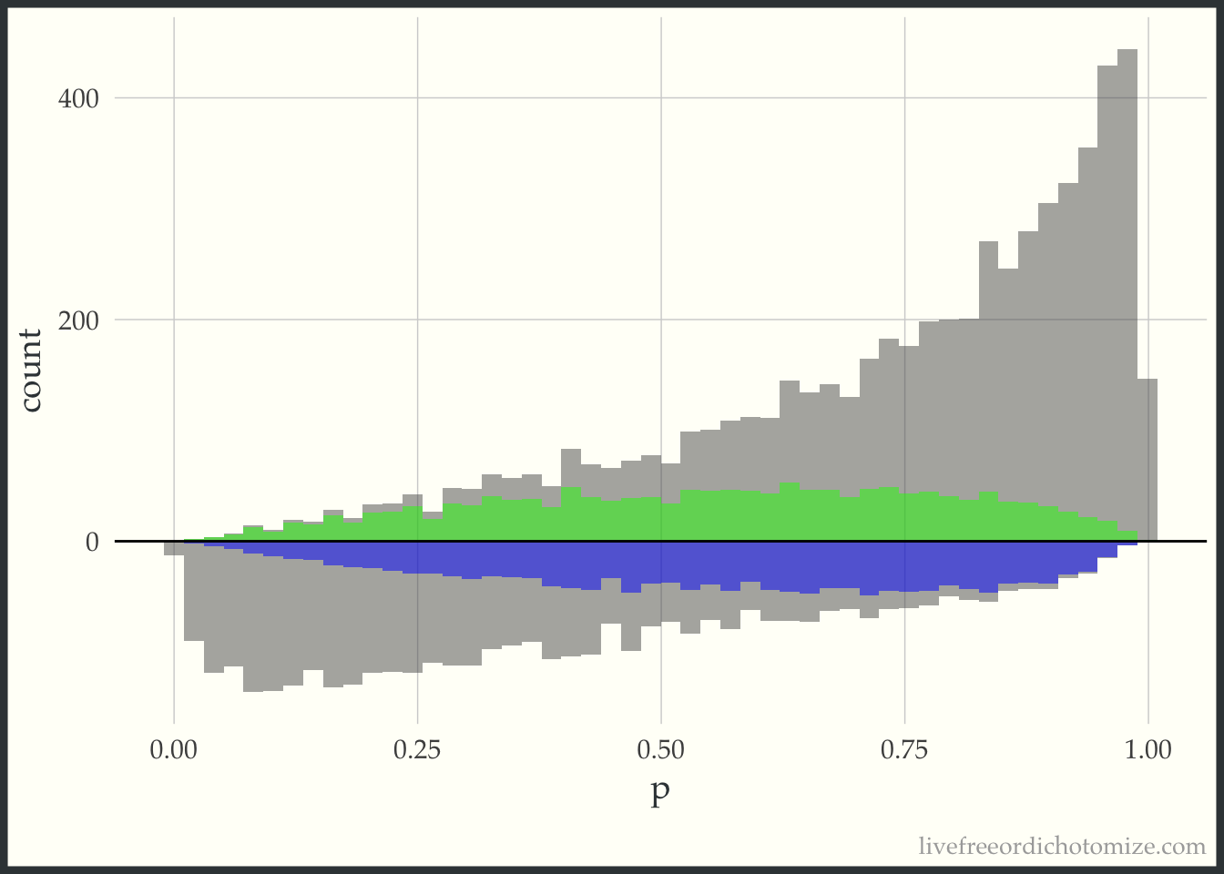
Now, for each weight I am going to overlay the pseudo-population that is created via weighting. The “pseudo-population” for the treated group is in green and the “pseudo-population” for the control group is in blue.
Notice here, the “pseudo-population” for the treatment group is exactly the same as the actual population. For the ATT, we take the treatment population as it is and try to weight the control population to match it.
Notice now this is the opposite of the previous graph. Now the target population is the control group, so this “pseudo-population” exactly matches the population of controls and the treatment group is weighted to try to mimic this.
This “pseudo-population” looks like a 1:1 matched population. In the regions where the treatment group is in the minority, on the left side of the graph, the controls are weighted to match the distribution of the treated. In the regions where the control group is in the minority, on the right side of the graph, the treated are weighted to match the distribution of the controls.
This looks a lot like the ATM graph, except shifted just a bit to improve the variance properties.
Estimating the treatment effect
Now that we have a bit of an understanding of what these weights do, we can estimate the treatment effect in each of these “pseudo-populations”. Mathematically, we can write this as follows, with the outcome for each individual defined as \(Y_i\), the treatment \(Z_i\) and the weight \(w_i\).
And we did it! Hopefully this helped to elucidate what is going on with propensity score weighting - please let me know if there are any parts that can be clarified!