library(tidyverse)
library(ggridges)

d <- read_csv("https://github.com/nytimes/covid-19-data/raw/master/us-counties.csv")
d <- d %>%
  filter(state == "Georgia",
         county %in% c("Cobb", "DeKalb", "Fulton", "Gwinnett", "Hall")) %>%
  group_by(county) %>%
mutate(case = c(cases[1], diff(cases))) Graph detective
rstats
covid-19
data visualizations
A plot has been floating around on Twitter from Georgia where the x-axis is all scampled. Let’s look into it and see if we can fix it!
A plot has been floating around on Twitter from Georgia where the x-axis is all scrambled. Let’s look into it and see if we can fix it!
From GA DPH, wtf?
— Dale Howard (@fdhjr71) May 16, 2020
"On the official Georgia COVID stats web page is this graph. Looks good, getting better, right? Look closer at the dates on the X-axis. They have arranged the dates out of order to create a declining appearance."@GaDPH @georgiagov pic.twitter.com/ScqExnI0aQ
I pulled in the NY Times data to look at this. It looks like their estimates are different from the ones in the original graph (this is not unusual, I’ve noticed for my county the counts are quite different depending on which sources you pull from), so I am going to recreate the original atrocity using the NY Times data for comparison.
Remake their silly plot with NY Times data
d %>%
  filter(date >= "2020-04-26", date <= "2020-05-09") %>%
  mutate(
    date = format(date, "%d%b%Y"),
    date = factor(date,
                  levels = c("28Apr2020", "27Apr2020", "29Apr2020",
                             "01May2020", "30Apr2020", "04May2020",
                             "06May2020", "05May2020", "02May2020",
                             "07May2020", "26Apr2020", "03May2020",
                             "08May2020", "09May2020"))) %>%
  group_by(date) %>%
  mutate(rank = rank(-case, ties = "first")) %>%
  ggplot(aes(x = date, y = case, group = rank, fill = county)) +
  geom_col(position = position_dodge()) +
  scale_x_discrete(guide = guide_axis(n.dodge = 2)) +
  scale_fill_manual("County",
                    values = c("#5854A8", "#46868E", "#958648",
                               "#8F5D37", "#5D98DB"),
                    guide =  guide_legend(title.position = "top",
                                          title.hjust = 0.5)) +
  ggtitle(
    "Top 5 Counties with the Greatest Number of Confirmed COVID-19 Cases",
    subtitle = "The chart below represents the most impacted counties over the past 15 days and the number of cases over time.") +
  theme_classic() +
  theme(legend.position = "top",
        panel.background = element_rect(fill = "#182F4E"),
        plot.background = element_rect(fill = "#182F4E"),
        axis.line = element_line(color = "white"),
        axis.text = element_text(color = "white"),
        axis.title = element_text(color = "white"),
        legend.background = element_rect(fill = "#182F4E"),
        legend.text = element_text(color = "white"),
        legend.title = element_text(color = "white"),
        title = element_text(color = "white"))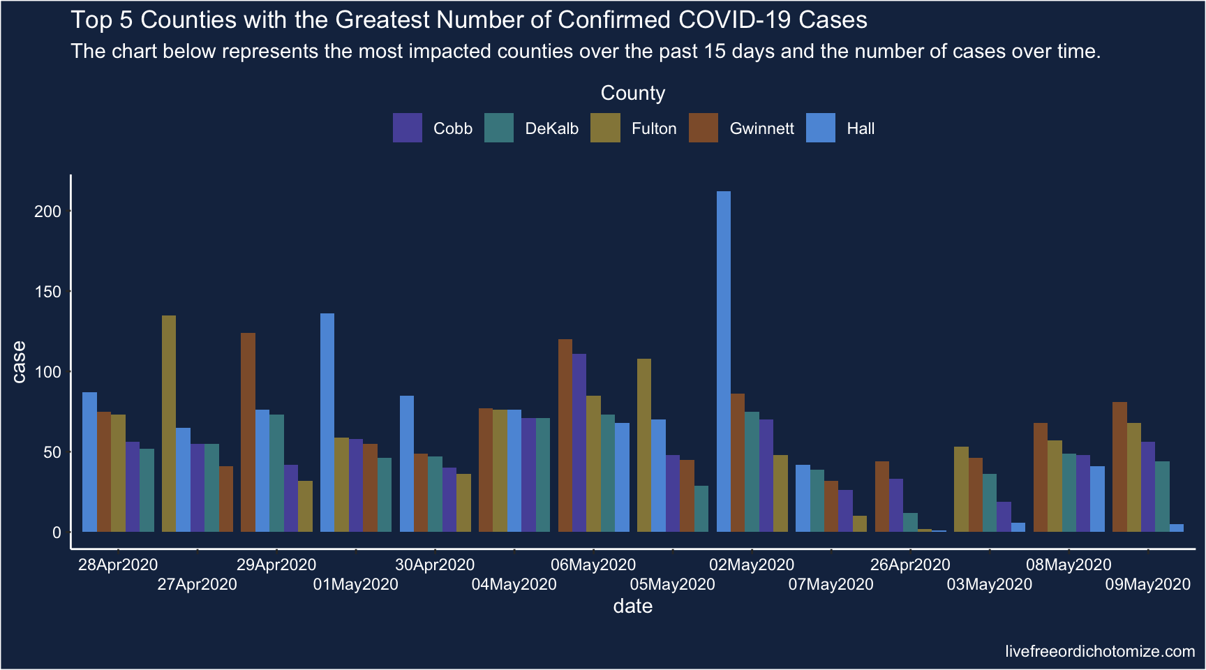
Hmm, this is a remake of their plot, but with NY Times data. The dates are in the same order as theirs, but it doesn’t give the same misleading message because they seemed to have sorted their x-axis to make it look like the cases were descending. We can remake that misleading plot using NY Times data too, though!
Shuffled, still bad, plot
d %>%
  filter(date >= "2020-04-26", date <= "2020-05-09") %>%
  mutate(
    date = format(date, "%d%b%Y"),
    date = factor(date,
                  levels = c("02May2020", "06May2020", "04May2020",
                             "01May2020", "27Apr2020", "29Apr2020",
                             "28Apr2020", "05May2020", "08May2020",
                             "30Apr2020", "09May2020", "03May2020",
                             "07May2020", "26Apr2020"))) %>%
  group_by(date) %>%
  mutate(rank = rank(-case, ties = "first")) %>%
  ggplot(aes(x = date, y = case, group = rank, fill = county)) +
  geom_col(position = position_dodge()) +
  scale_x_discrete(guide = guide_axis(n.dodge = 2)) +
  scale_fill_manual("County",
                    values = c("#5854A8", "#46868E", "#958648",
                               "#8F5D37", "#5D98DB"),
                    guide =  guide_legend(title.position = "top",
                                          title.hjust = 0.5)) +
  ggtitle(
    "Top 5 Counties with the Greatest Number of Confirmed COVID-19 Cases",
    subtitle = "The chart below represents the most impacted counties over the past 15 days and the number of cases over time.") +
  theme_classic() +
  theme(legend.position = "top",
        panel.background = element_rect(fill = "#182F4E"),
        plot.background = element_rect(fill = "#182F4E"),
        axis.line = element_line(color = "white"),
        axis.text = element_text(color = "white"),
        axis.title = element_text(color = "white"),
        legend.background = element_rect(fill = "#182F4E"),
        legend.text = element_text(color = "white"),
        legend.title = element_text(color = "white"),
        title = element_text(color = "white"))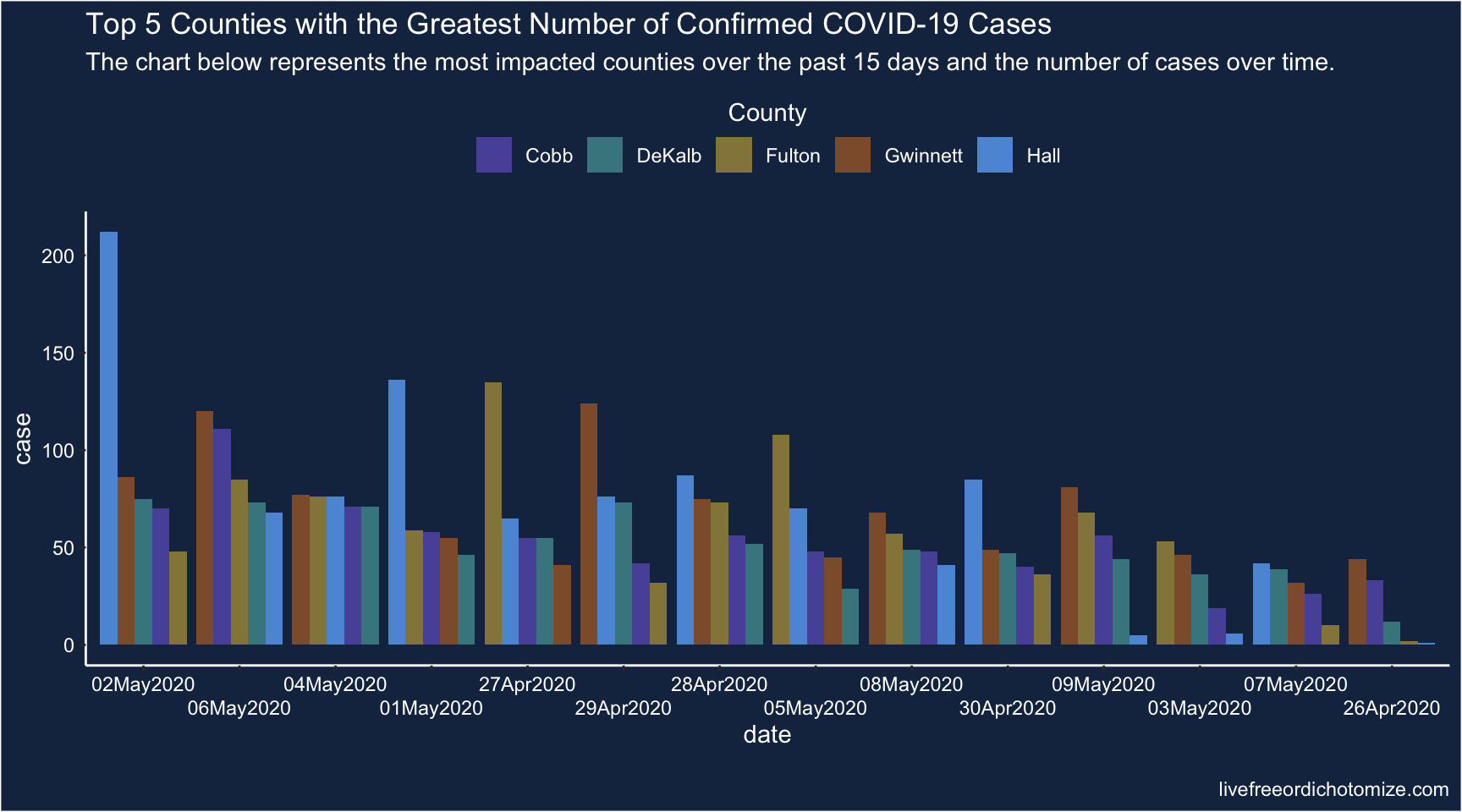
Nice, that’s good and misleading.
Fix plot
Now this is what the plot would look like if we plot the x-axis sensibly.
Why am I not using something sensible like scale_x_date(date_breaks = "1 day", guide = guide_axis(n.dodge = 2)), well I was, but there was a weird issue that it either cut off half of the bars on the first & last date, or added an extra date to either side. I had a weird hack that fixed it, but then it didn’t nicely match up with the other plot, so here we are.
d %>%
  filter(date >= "2020-04-26", date <= "2020-05-09") %>%
  mutate(
    date = format(date, "%d%b%Y"),
    date = factor(date,
                  levels = c("26Apr2020", "27Apr2020", "28Apr2020",
                             "29Apr2020", "30Apr2020", "01May2020",
                             "02May2020", "03May2020", "04May2020",
                             "05May2020", "06May2020", "07May2020",
                             "08May2020", "09May2020"))) %>%
  ggplot(aes(x = date, y = case, group = county, fill = county)) +
  geom_col(position = position_dodge()) +
  scale_x_discrete(guide = guide_axis(n.dodge = 2)) +
  scale_fill_manual("County",
                    values = c("#5854A8", "#46868E", "#958648",
                               "#8F5D37", "#5D98DB"),
                    guide = guide_legend(title.position = "top",
                                         title.hjust = 0.5)) +
  ggtitle(
    "Top 5 Counties with the Greatest Number of Confirmed COVID-19 Cases",
    subtitle = "The chart below represents the most impacted counties over the past 15 days and the number of cases over time.") +
  theme_classic() +
  theme(legend.position = "top",
        panel.background = element_rect(fill = "#182F4E"),
        plot.background = element_rect(fill = "#182F4E"),
        axis.line = element_line(color = "white"),
        axis.text = element_text(color = "white"),
        axis.title = element_text(color = "white"),
        legend.background = element_rect(fill = "#182F4E"),
        legend.text = element_text(color = "white"),
        legend.title = element_text(color = "white"),
        title = element_text(color = "white"))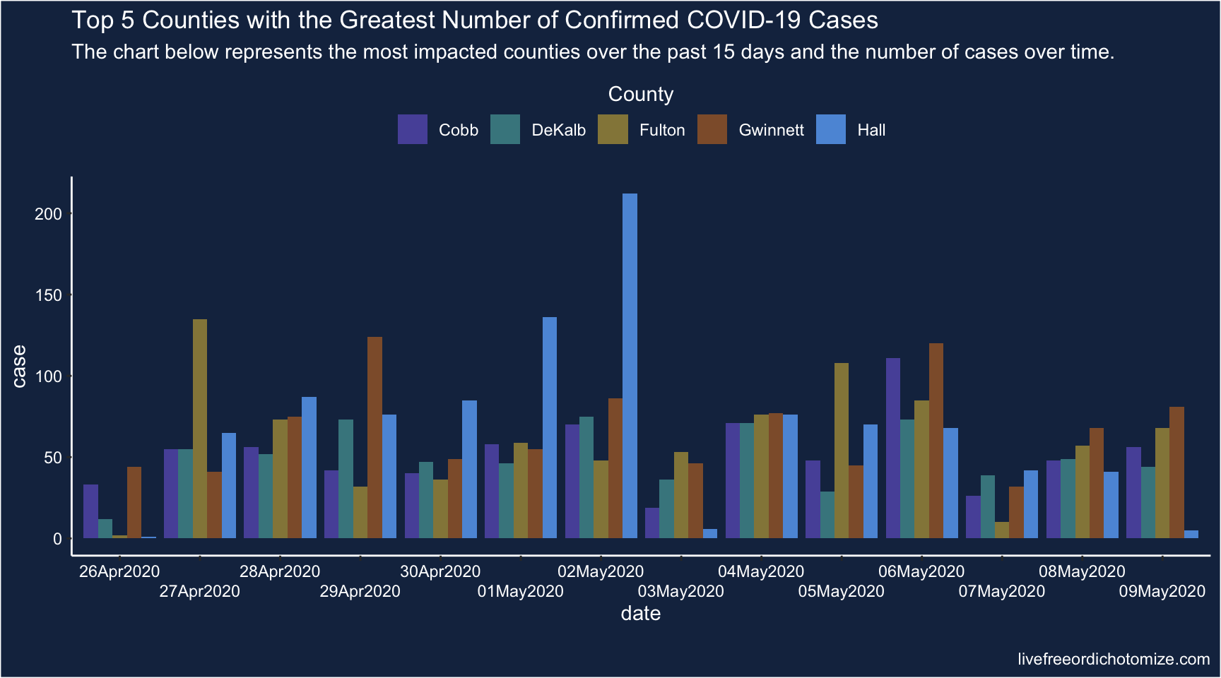
Hmm, ok that is better, in that at least the x-axis is sensible. It’s still pretty hard to glean anything from this graph. Let’s try a few different visualizations.
Overlaid Histograms
d %>%
  filter(date >= "2020-04-26", date <= "2020-05-09") %>%
  ggplot(aes(x = date, y = case, group = county, fill = county)) +
  geom_col(position = "identity", alpha = 0.75) +
  scale_x_date(date_labels = "%d%b%Y",
               date_breaks = "5 days") +
  scale_fill_manual("County",
                    values = c("#5854A8", "#46868E", "#958648",
                               "#8F5D37", "#5D98DB"),
                    guide = guide_legend(title.position = "top",
                                         title.hjust = 0.5)) +
  ggtitle(
    "Top 5 Counties with the Greatest Number of Confirmed COVID-19 Cases",
    subtitle = "The chart below represents the most impacted counties over the past 15 days and the number of cases over time.") +
  theme_classic() +
  theme(legend.position = "top",
        panel.background = element_rect(fill = "#182F4E"),
        plot.background = element_rect(fill = "#182F4E"),
        axis.line = element_line(color = "white"),
        axis.text = element_text(color = "white"),
        axis.title = element_text(color = "white"),
        legend.background = element_rect(fill = "#182F4E"),
        legend.text = element_text(color = "white"),
        legend.title = element_text(color = "white"),
title = element_text(color = "white")) 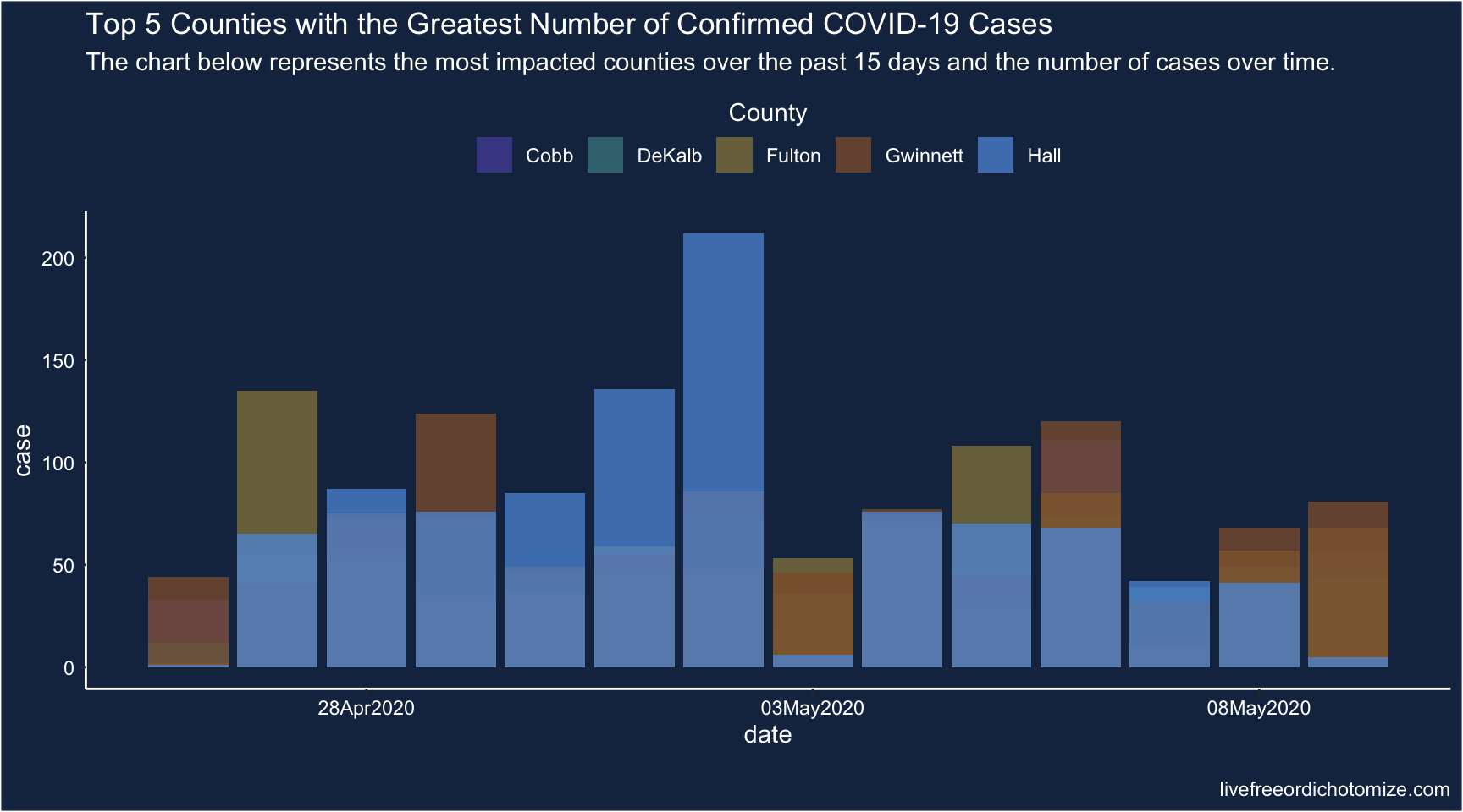
Blah too busy.
Facet Histograms
d %>%
  filter(date >= "2020-04-26", date <= "2020-05-09") %>%
  ggplot(aes(x = date, y = case, group = county, fill = county)) +
  geom_col() +
  scale_x_date(date_labels = "%d%b%Y",
               date_breaks = "5 days") +
  scale_fill_manual("County",
                    values = c("#5854A8", "#46868E", "#958648",
                               "#8F5D37", "#5D98DB"),
                    guide = guide_legend(title.position = "top",
                                         title.hjust = 0.5)) +
  ggtitle(
    "Top 5 Counties with the Greatest Number of Confirmed COVID-19 Cases",
    subtitle = "The chart below represents the most impacted counties over the past 15 days and the number of cases over time.") +
  theme_classic() +
  theme(legend.position = "top",
        panel.background = element_rect(fill = "#182F4E"),
        plot.background = element_rect(fill = "#182F4E"),
        axis.line = element_line(color = "white"),
        axis.text = element_text(color = "white"),
        axis.title = element_text(color = "white"),
        legend.background = element_rect(fill = "#182F4E"),
        legend.text = element_text(color = "white"),
        legend.title = element_text(color = "white"),
        title = element_text(color = "white")) +
  facet_grid(county~.)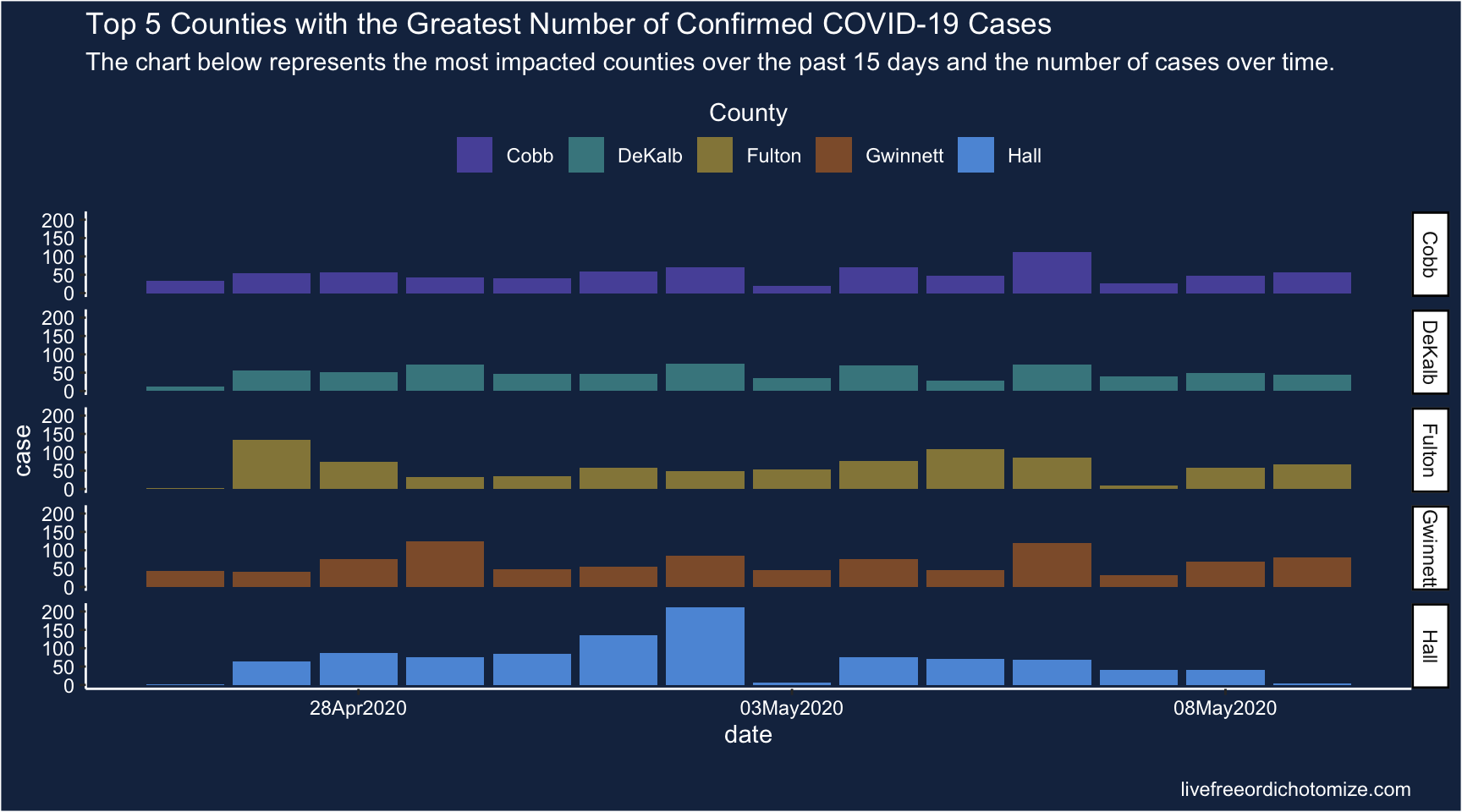
This is okay, I still find it kind of hard to compare though.
Maybe a combo?
d %>%
  filter(date >= "2020-04-26", date <= "2020-05-09") %>%
  ggplot(aes(x = date, y = county, fill = county, height = case)) +
  geom_density_ridges(scale = 4, stat = "identity") +
  scale_x_date(date_labels = "%d%b%Y",
               date_breaks = "5 days") +
  scale_fill_manual("County",
                    values = c("#5854A8", "#46868E", "#958648",
                               "#8F5D37", "#5D98DB"),
                    guide = guide_legend(title.position = "top",
                                         title.hjust = 0.5)) +
  ggtitle(
    "Top 5 Counties with the Greatest Number of Confirmed COVID-19 Cases",
    subtitle = "The chart below represents the most impacted counties over the past 15 days and the number of cases over time.") +
  theme_classic() +
  theme(legend.position = "top",
        panel.background = element_rect(fill = "#182F4E"),
        plot.background = element_rect(fill = "#182F4E"),
        axis.line = element_line(color = "white"),
        axis.text = element_text(color = "white"),
        axis.title = element_text(color = "white"),
        legend.background = element_rect(fill = "#182F4E"),
        legend.text = element_text(color = "white"),
        legend.title = element_text(color = "white"),
title = element_text(color = "white")) 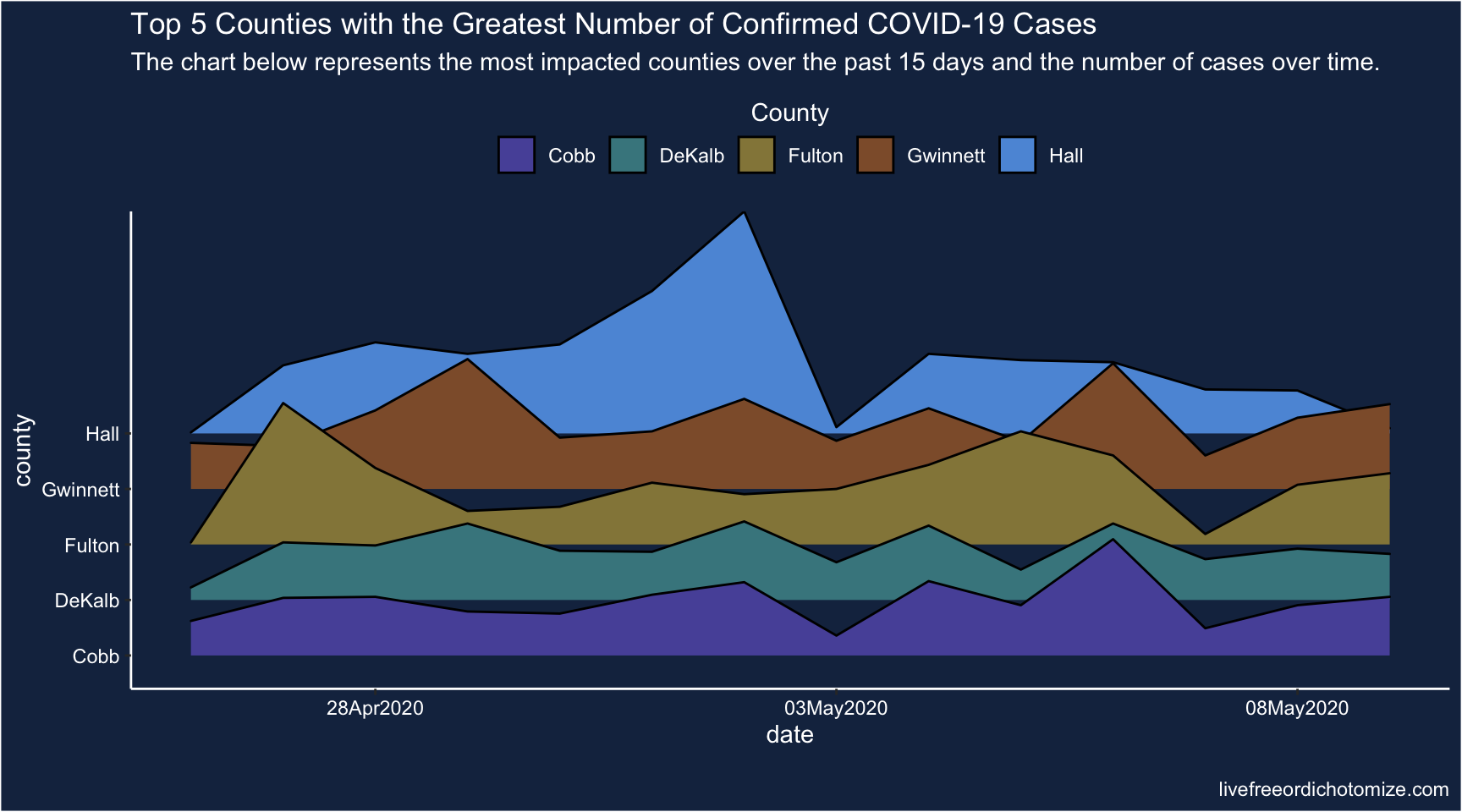
Ridgeline plots are nice, but I’m still not sure I get a lot out of this vis. Hmm.
Line plot
d %>%
  filter(date >= "2020-04-26", date <= "2020-05-09") %>%
  ggplot(aes(x = date, y = case, color = county)) +
  geom_line() +
  geom_point() +
  scale_x_date(date_labels = "%d%b%Y",
               date_breaks = "5 days") +
  scale_color_manual("County",
                     values = c("#5854A8", "#46868E", "#958648",
                                "#8F5D37", "#5D98DB"),
                     guide = guide_legend(title.position = "top",
                                          title.hjust = 0.5)) +
  ggtitle(
    "Top 5 Counties with the Greatest Number of Confirmed COVID-19 Cases",
    subtitle = "The chart below represents the most impacted counties over the past 15 days and the number of cases over time.") +
  theme_classic() +
  theme(legend.position = "top",
        panel.background = element_rect(fill = "#182F4E"),
        plot.background = element_rect(fill = "#182F4E"),
        axis.line = element_line(color = "white"),
        axis.text = element_text(color = "white"),
        axis.title = element_text(color = "white"),
        legend.background = element_rect(fill = "#182F4E"),
        legend.text = element_text(color = "white"),
        legend.title = element_text(color = "white"),
        title = element_text(color = "white"))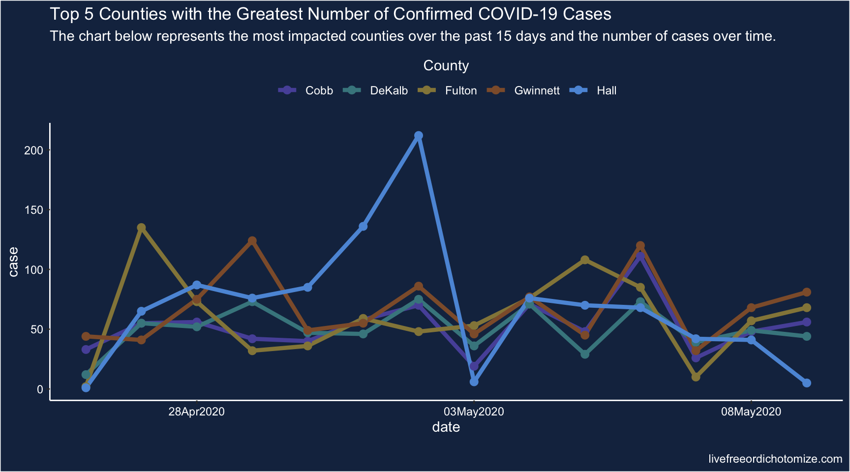
Meh.
Bump chart
Joshua suggested a bump chart with the dots scaled based on the number of cases.
Would something like a bump chart be better? You could encode severity in size maybe?
— Joshua de la Bruere (@delaBJL) May 17, 2020
d %>%
  filter(date >= "2020-04-26", date <= "2020-05-09") %>%
  group_by(date) %>%
  mutate(rank = rank(-case, ties = "first")) %>%
  ggplot(aes(x = date, y = rank, color = county)) +
  geom_line() +
  geom_point(aes(size = case)) +
  scale_x_date(date_labels = "%d%b%Y",
               date_breaks = "5 days") +
  scale_size_continuous("Number of cases",
                        guide = guide_legend(title.position = "top",
                                             title.hjust = 0.5)) +
  scale_color_manual("County",
                     values = c("#5854A8", "#46868E", "#958648",
                                "#8F5D37", "#5D98DB"),
                     guide = guide_legend(title.position = "top",
                                          title.hjust = 0.5)) +
  ggtitle(
    "Top 5 Counties with the Greatest Number of Confirmed COVID-19 Cases",
    subtitle = "The chart below represents the most impacted counties over the past 15 days and the number of cases over time.") +
  theme_classic() +
  theme(legend.position = "top",
        panel.background = element_rect(fill = "#182F4E"),
        plot.background = element_rect(fill = "#182F4E"),
        axis.line = element_line(color = "white"),
        axis.text = element_text(color = "white"),
        axis.title = element_text(color = "white"),
        legend.background = element_rect(fill = "#182F4E"),
        legend.text = element_text(color = "white"),
        legend.title = element_text(color = "white"),
        title = element_text(color = "white"))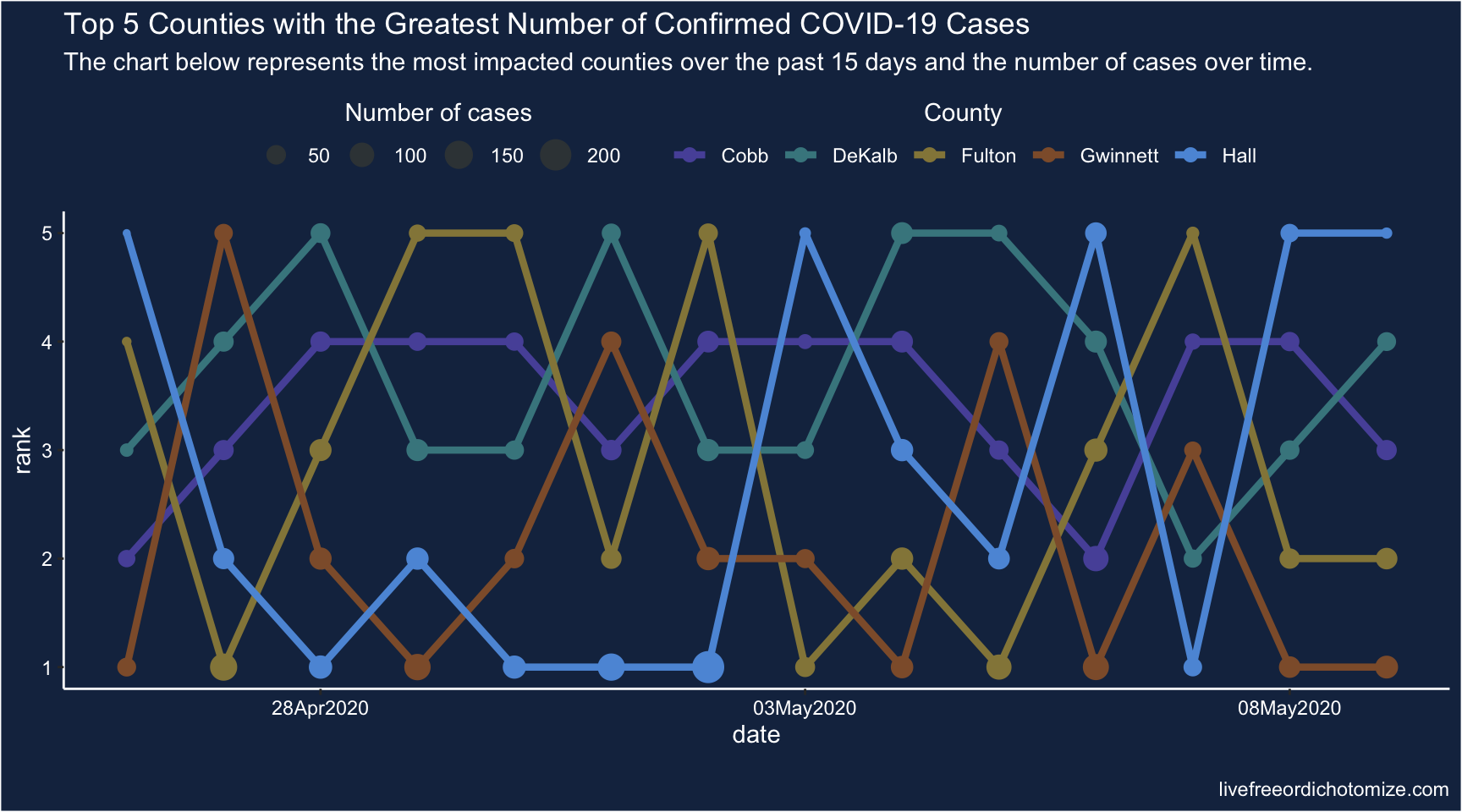
I don’t hate it…but it is still kind of busy. I think part of the problem is it is quite hard to compare 5 things over two axis simultaneously without a clear signal. Maybe if we could reduce it to comparisons between 2 things at a time?
Plotly
library(plotly)d %>%
filter(date >= "2020-04-26", date <= "2020-05-09") %>%
ggplot(aes(x = date, y = case, fill = county)) +
geom_col(position = "identity", alpha = 0.75) +
scale_x_date(date_labels = "%d%b%Y",
date_breaks = "5 days") +
scale_fill_manual("County",
values = c("#5854A8", "#46868E", "#958648",
"#8F5D37", "#5D98DB"),
guide = guide_legend(title.position = "top",
title.hjust = 0.5)) +
ggtitle(
"Top 5 Counties with the Greatest Number of Confirmed COVID-19 Cases",
subtitle = "The chart below represents the most impacted counties over the past 15 days and the number of cases over time.") +
theme_classic() +
theme(legend.position = "top",
panel.background = element_rect(fill = "#182F4E"),
plot.background = element_rect(fill = "#182F4E"),
axis.line = element_line(color = "white"),
axis.text = element_text(color = "white"),
axis.title = element_text(color = "white"),
legend.background = element_rect(fill = "#182F4E"),
legend.text = element_text(color = "white"),
legend.title = element_text(color = "white"),
title = element_text(color = "white")) -> p
ggplotly(p)You can click on the legend to hide counties, allowing you to compare just 2 at a time. This seems marginally better.
Barchart race
Joshua also suggested (and created) a barchart race! I actually think this may have some utility here because it helps narrow the focus (looking at one day at a time), which is part of the problem with these visualizations.
Maybe this is a job for a bar chart race! https://t.co/BnTvHxKZ6f
— Joshua de la Bruere (@delaBJL) May 17, 2020
If the goal is to show ranking across time. But that seems like a pretty volatile metric
The barchart races I’ve seen are typically cumulative, so I’m not sure this is exactly the right use case (and in this particular case, the rankings of the cumulative counts don’t change much over these 15 days), but let’s see how it looks.
I learned how to do this from Michael Toth’s blogpost How to Create a Bar Chart Race in R - Mapping United States City Population 1790-2010
library(gganimate)
d %>%
  filter(date >= "2020-04-26", date <= "2020-05-09") %>%
  group_by(date) %>%
  mutate(rank = rank(-case, ties = "first")) %>%
  ggplot(aes(x = -rank, y = case, fill = county)) +
  geom_tile(aes(y = case / 2, height = case), width = 0.9) +
  geom_text(aes(label = county), hjust = "right",
            colour = "white", fontface = "bold",
            nudge_y = -5) +
  scale_fill_manual(values = c("#5854A8", "#46868E", "#958648",
                               "#8F5D37", "#5D98DB")) +
  geom_text(aes(label = scales::comma(case)), hjust = "left",
            nudge_y = 5, colour = "white") +
  coord_flip(clip = "off") +
  scale_x_discrete("") +
  scale_y_continuous("") +
  theme_classic() +
  theme(panel.grid.major.y = element_blank(),
        panel.grid.minor.x = element_blank(),
        legend.position = "none",
        plot.margin = margin(1, 1, 1, 2, "cm"),
        axis.text.y = element_blank(),
        panel.background = element_rect(fill = "#182F4E"),
        plot.background = element_rect(fill = "#182F4E"),
        axis.line = element_line(color = "white"),
        axis.text = element_text(color = "white"),
        axis.title = element_text(color = "white"),
        title = element_text(color = "white")) +
  transition_time(date) +
  ease_aes("cubic-in-out") +
  labs(
    title = "Top 5 Counties with the Greatest Number of Confirmed \nCOVID-19 Cases",
    subtitle = "Date: {as.Date(frame_time)}",
    caption = "Data: NY Times\nGraph: @LucyStats") -> p
p